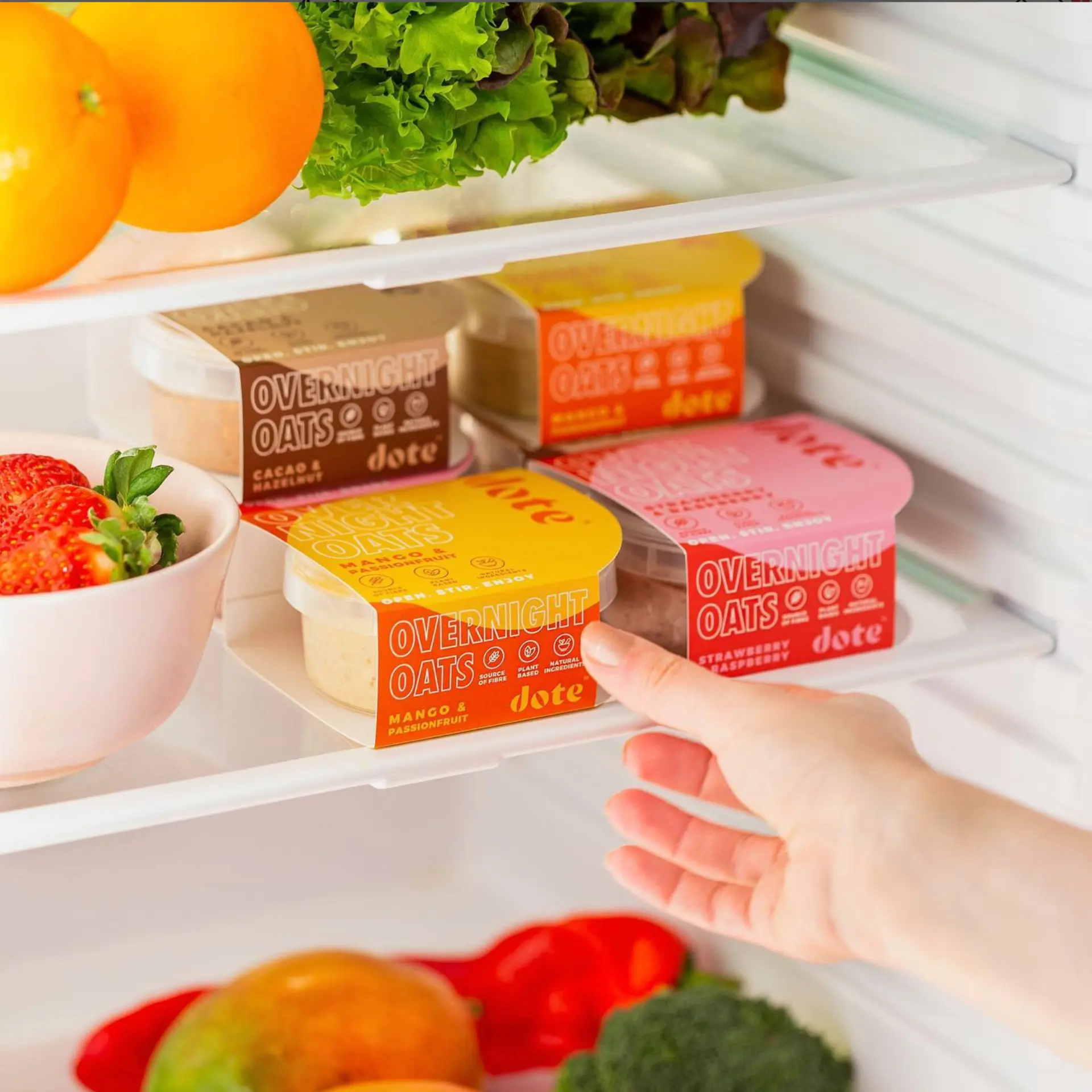
Breakfast that earns its place on the shelf.
Client
Dote
Sector
Food & drink
Services
- Brand identity
- Packaging
- Art direction
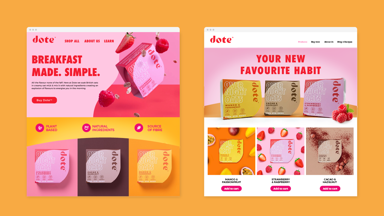
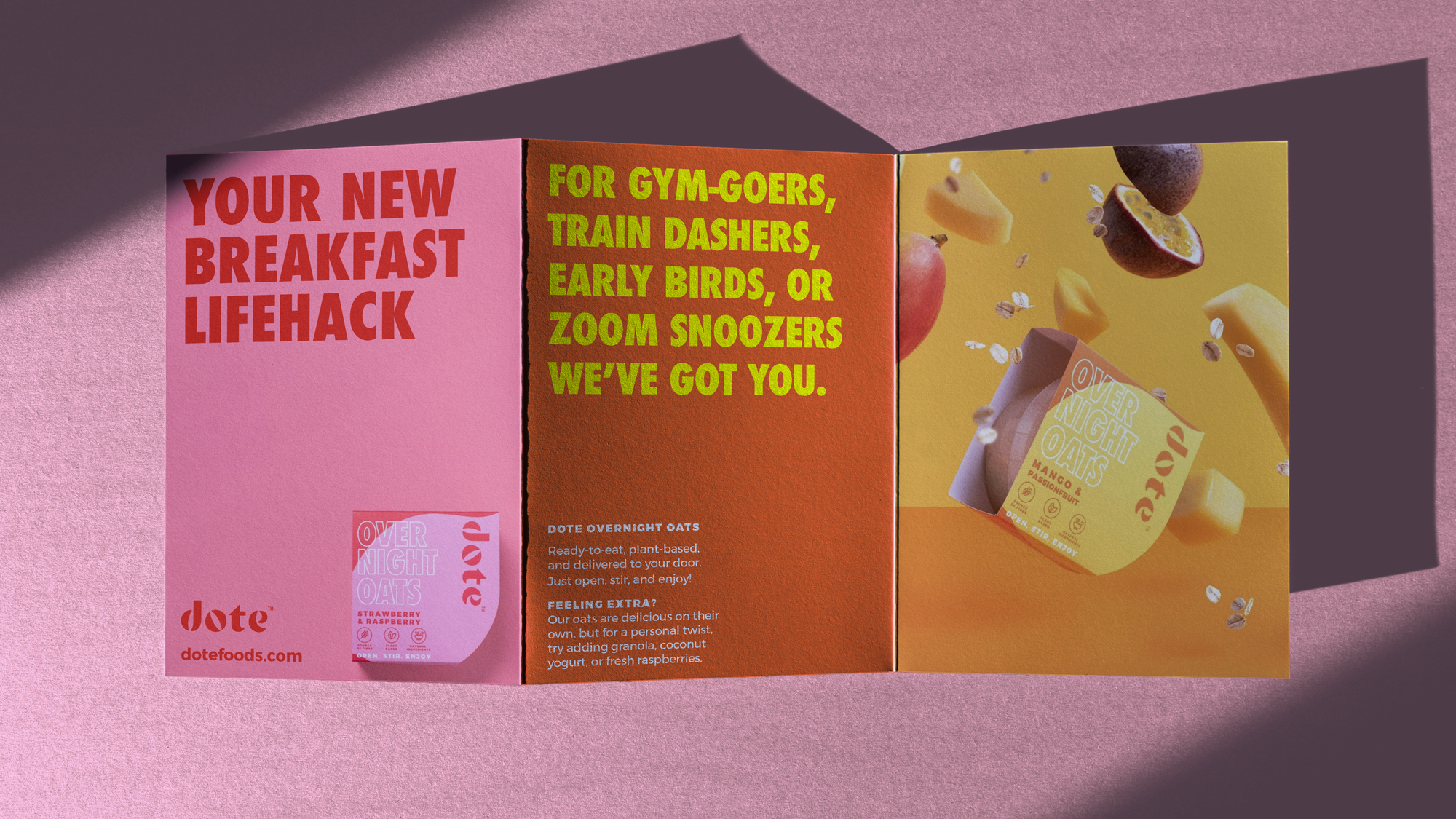
Dote makes overnight oats designed to nourish your mind, your body and the planet, all before you've properly woken up. Working closely with the founder, Shani, I crafted the brand: packaging, art direction, web, POS and social content.
Idea
Dote had something genuinely good to say: breakfast that's kind to you and to the planet in the same spoonful. The idea was to give that a personality to match. Something warm and full of character, that earns its spot on your shelf by being a joy to have around, and makes eating well feel like a treat rather than a task. Sustainability was there from the first sketch, not added at the end. Eco-friendly materials and a lighter footprint, woven through the design so the care showed in the details as much as the claims.
Making
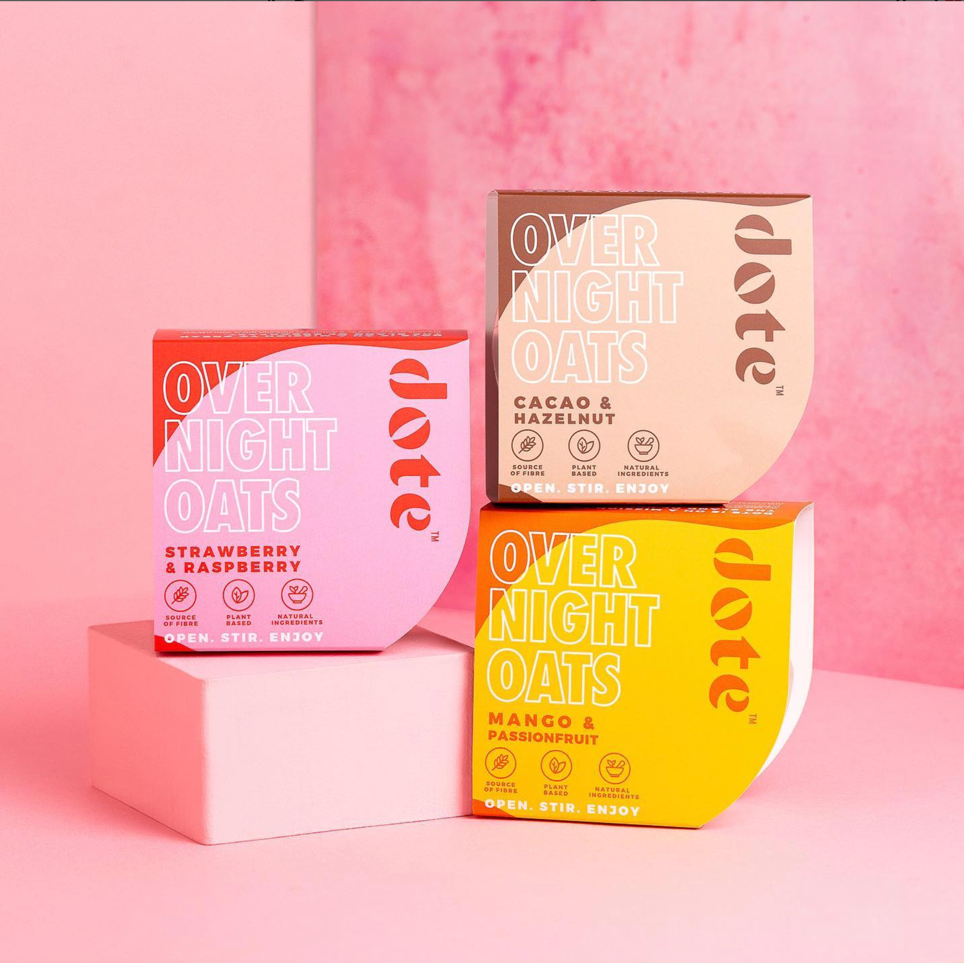
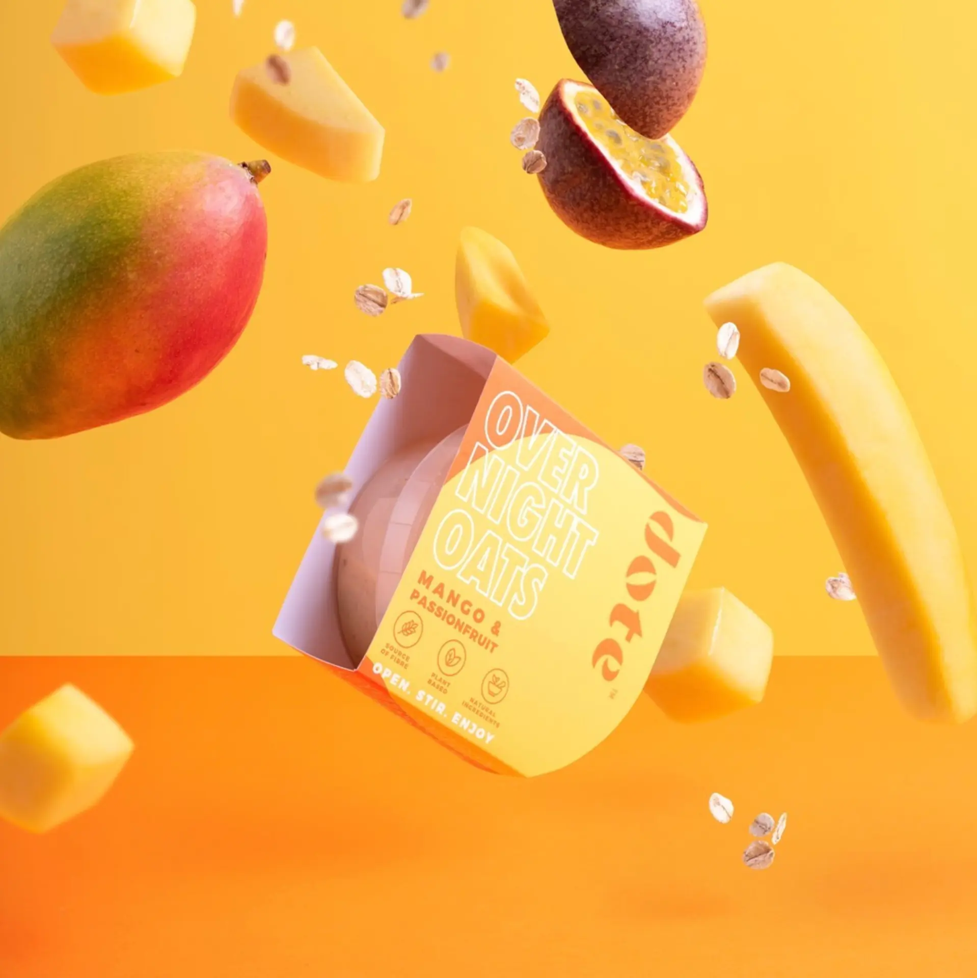
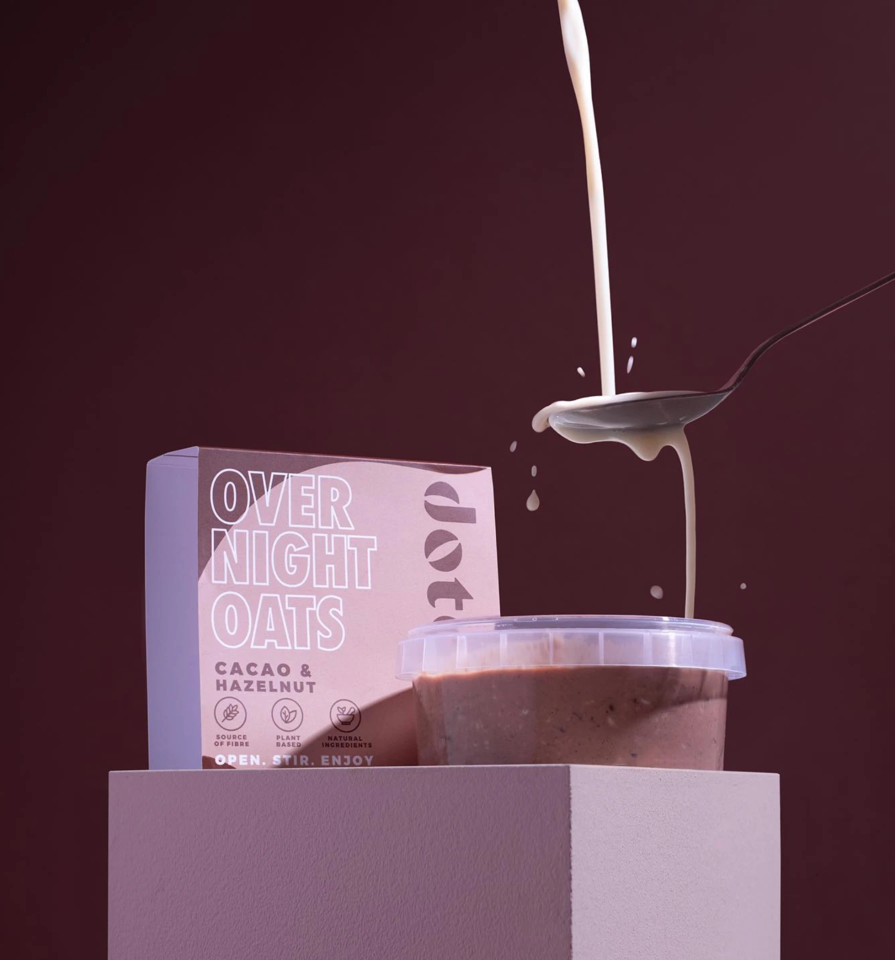
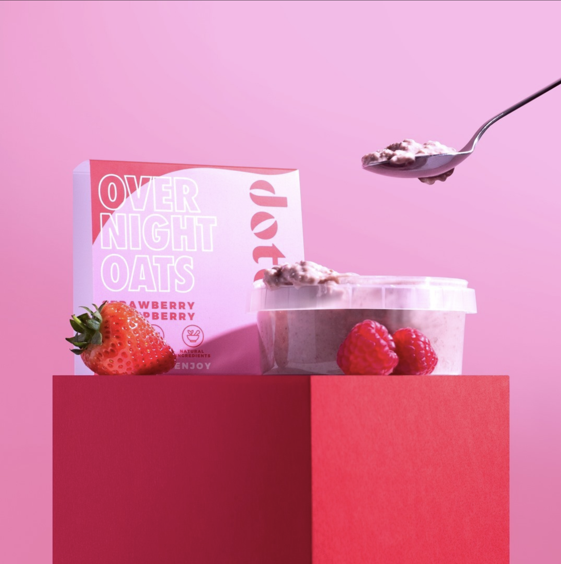
A bold flavour-led colour system does the heavy lifting: blood orange, mango yellow, cacao brown and berry pink, each carrying the same confident type lock-up. Oversized 'Overnight Oats' typography anchors every pot, with a simple 'Open. Stir. Enjoy.' line and a compact icon set for source of fibre, plant based and natural ingredients.
The sleeve design was built to work in the round — recognisable from the lid down as well as face-on, so the range reads as a family however it lands on the shelf.
“I loved working with Sarah! Not only was she incredibly creative she was also a fantastic listener and able to understand what I was looking for in my packaging design. She was a genuine joy to work with, and I'd recommend her to anyone!”

Keen to chat?
Get in touch with me or have a look at my work to see if we'd be a good fit.